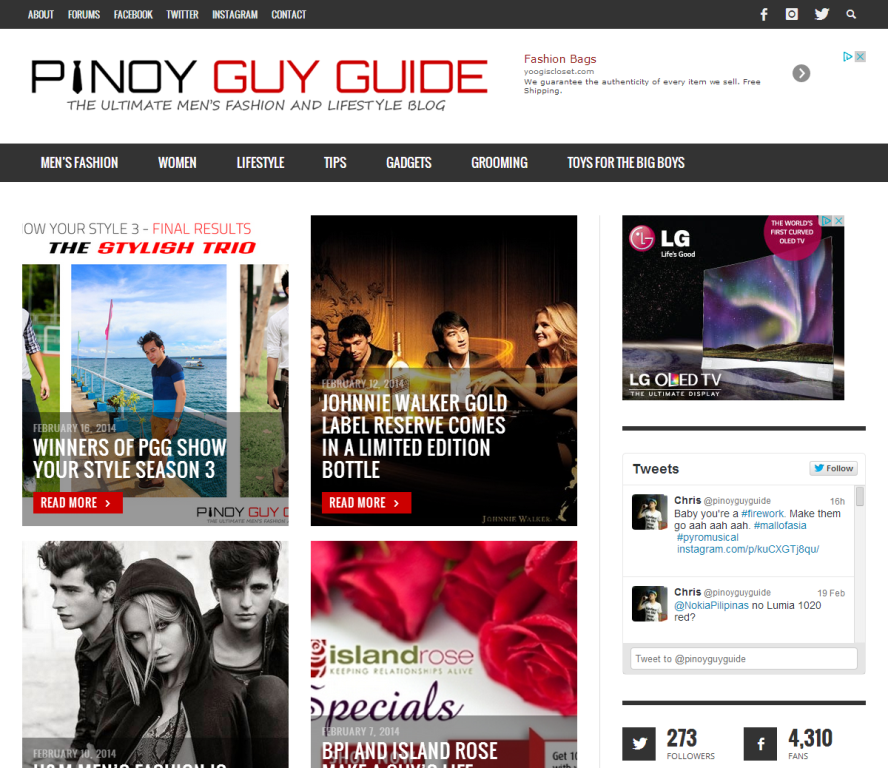
In celebration of PGG’s 7th year anniversary this 2014, I am launching the new revolutionary PGG layout which is computer, tablet and mobile-phone ready. The new layout takes inspiration from fast-evolving web technologies these days. It is mostly tile-based so in the front page you will see headlines and numerous tiled photos which resembles that of a true modern online men’s magazine and blog. Posts are arranged in such a way that the latest update remains on top.
Everything is much easier to find. We have a search functionality and social media buttons on the top-most menu bar:
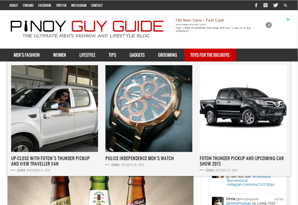
Highlighting the category menu bar below PGG’s logo will give you a preview of the most recent posts related to that category. As an example, I did a mouseover for the “Toys for the Big Boys” category here and look, you’ll see a preview of the latest men’s gear that was featured here in Pinoy Guy Guide.
I retained some elements of the sidebar. You will still see the Best of Pinoy Guy Guide on the right which is a favorite among many of PGG’s readers:
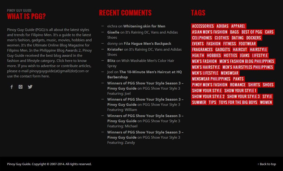
And the footer is now more important than ever. It now contains About PGG, The Most Recent Comments and Tags which are very useful if you want to browse for a certain topic.
The layout is still in its beta version so go ahead play around it and experiment. Enjoy exploring the new and improved PGG blog. More updates and improvements coming soon.
Let me know what you think of the new PGG look by posting a comment below.


6 comments
Hey, Chris.
I’ve just seen this new innovation and it’s really impressive and congratulations bro!! 😀
Joel, thank you. I wanted to give PGG readers a more delightful user experience.
Well done! Happy 7th and congrats PGG! 😀
Thank you Kris! 🙂
Congrats sir Chris! Astig ng bagong layout!
Salamat Jep! welcome sa bagong PGG 🙂